DERMAINK
UX Case Study 2018
OVERVIEW
The objective for DermaINK was to find the reason why is it easier to just walk into any random Tattoo Parlor to find an artist than to find one online. My goal was to make a product that would entice the artist to advertise themselves on the app and patrons finding them in their local cities and states. That would, in turn, solve only one problem but also showcase that they have the skill to create your vision of artistic expression.
Category: Tattoo App Design
Role: UX Design, UI Design
APPROACH
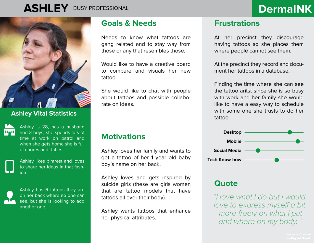
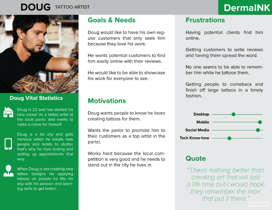
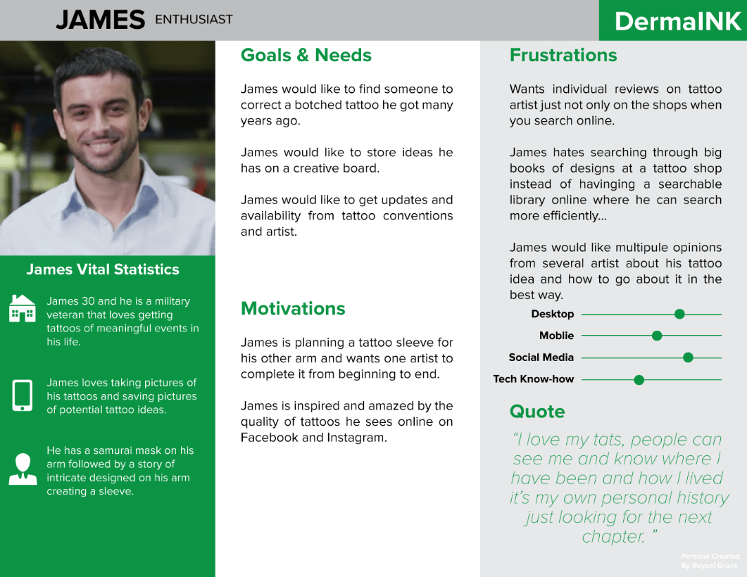
My approach was rooted in a comprehensive process that began with discovery and wireframe prototyping, followed by the creation of detailed Personas to guide the design. I rigorously tested my prototypes, always prioritizing a deep understanding of user needs to ensure the final product aligned with their expectations and desires. View Interview Document | View Analysis Document
CHALLENGES
A few challenging parts during the creation of DermaINK was learning new terms and setting a project schedule in know what needed to be done in a specific order. I wanted the DermaINK app in really be able to solve the problem why is it easier to find a artist walking into tattoo parlors than to be able to find one online in your local city. In my research & interviews I discovered that many people that attain a tattoo never care to remember the artist itself because of the way they found them. From interviewing the artist creating the work they have a nomadic culture of living free from constraints, being apart a tribe in a scene.
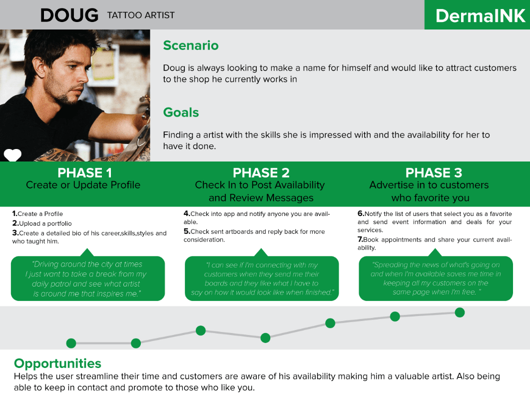
The tattoo industry is mostly made of apprenticeships and earning your keep from years of practice and real experience on customers. So I mentioned this idea to my mentor what if in the artist bio mentioned the artists mentors and their experience with the body of work. So other artist can self reflect on their own success and communicate with their customers all in one. While designing this app I thought of every tattoo parlor as a team and I wanted each place to showcase their artist like a roster who is highly rated, talented newcomer and etc.
Being able to see who works at a establishment will reduce travel time and truly give the user a wider variety to choose great artists in a smaller travel distance and gives the artist more incentive to promote themselves on another platform besides Facebook. Being a multimedia artist I designed my app in Illustrator and Photoshop. Not having a mac and using sketch was my greatest challenge because I would like to know standard industry software.
USER RESEARCH
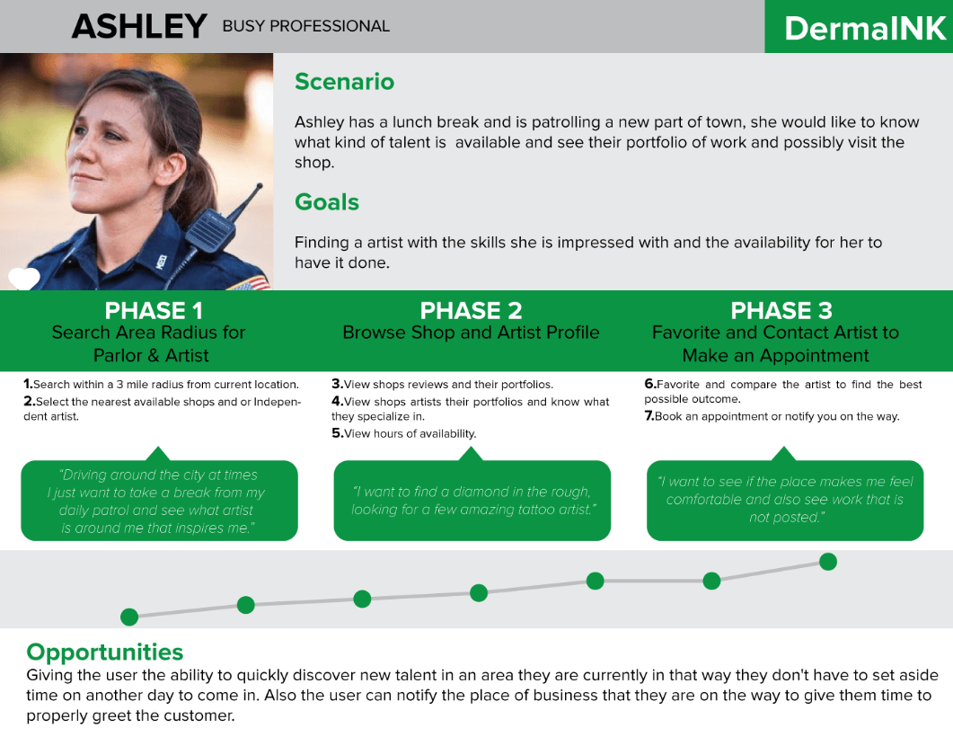
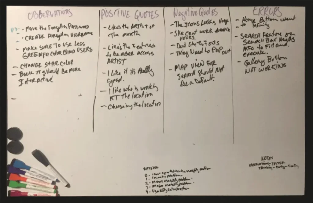
I interviewed friends, tattoo artist, military and police who have had experiences with getting tattoos and how has it affected their day to day lives and in their workplace. I created an affinity map to quickly view key insights.
- All tattoos have a process of thought that goes into them, and there is a desire to have them.
- All tattoo artists were forgotten, and only a basic impression is left in the receiving person’s mind.
- Art is the basis of attracting the customer to the shop.
- They find old-fashioned techniques in finding tattoo shops either by word of mouth or walking into random shops.
- Law enforcement needs to check tattoos in a database, to know what tattoos can affect employment. This could be a useful tool to inform those who are unaware.
- A deep desire for what’s important to the person is what makes a great tattoo it is subjective.
- A portfolio work is important but it needs to be implied that other styles are available that the artist is good at.
- The artist bio may not be as important as first thought but if doing a large project recurring work may need deeper information for the customer.
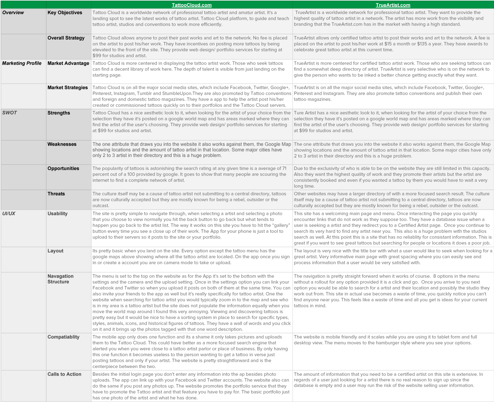
COMPETITIVE ANALYSIS
Knowing who your rivals are in your market is critical. Detecting what short comings they encounter its your advantage in developing a superior product you can dominate on the virtual app store shelves.
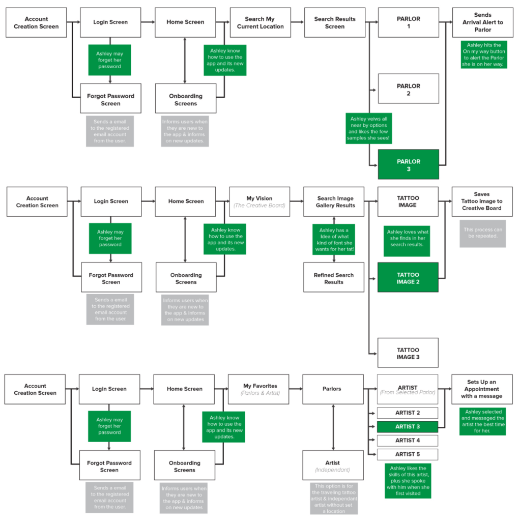
USER FLOW
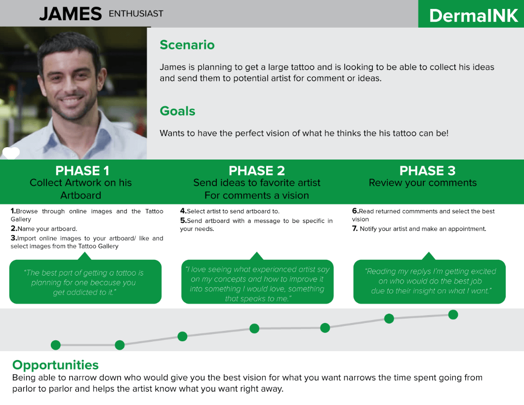
User flows were created for each persona to predict what their interaction with the app to quickly solve their initial problem.
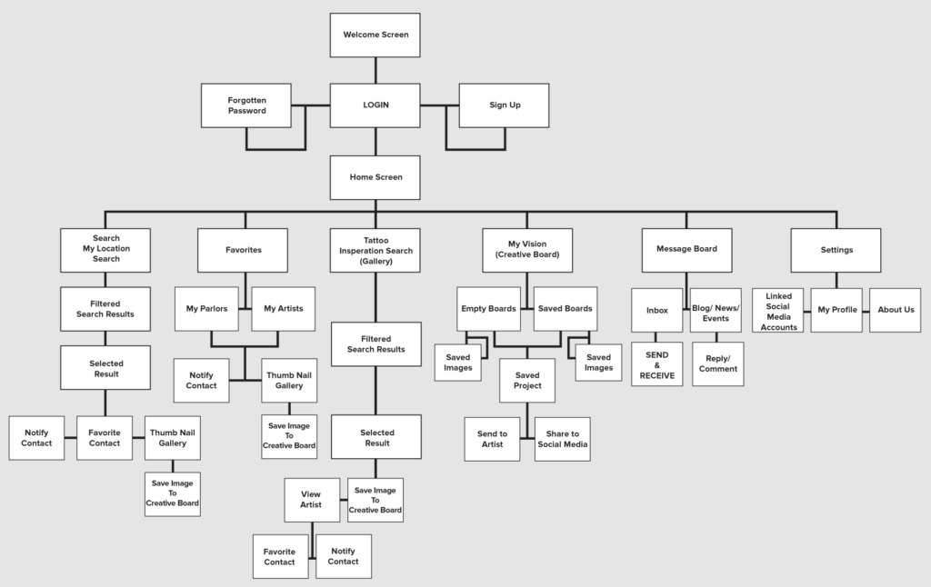
INFORMATION ARCHITECTURE
Site Map for DermaInk
MID FIDELITY PROTOTYPES
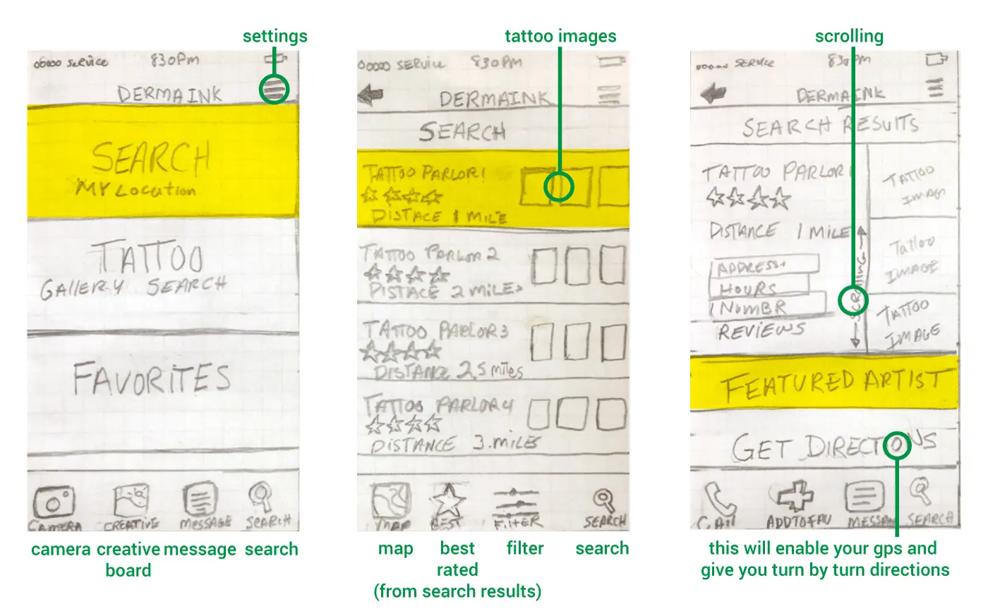
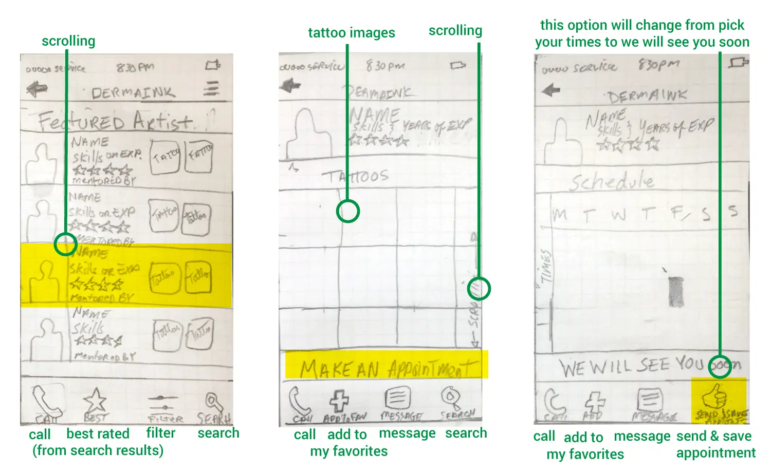
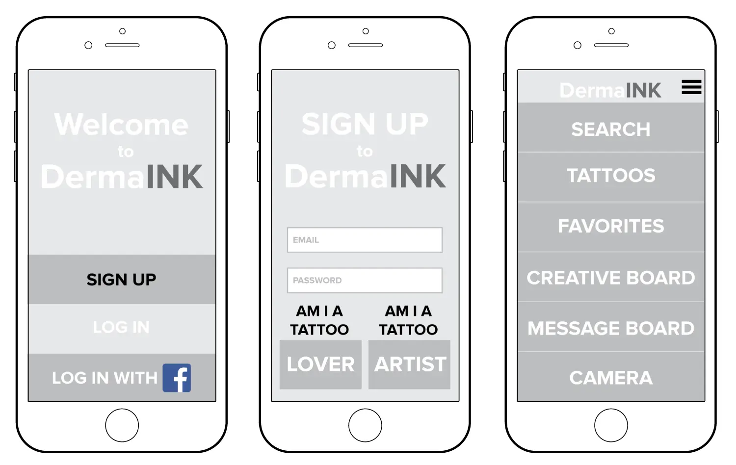
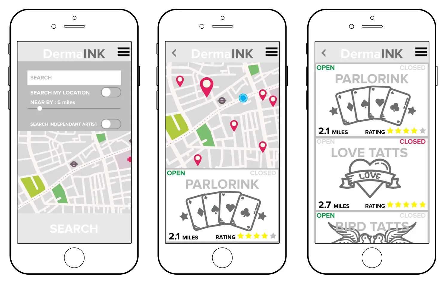
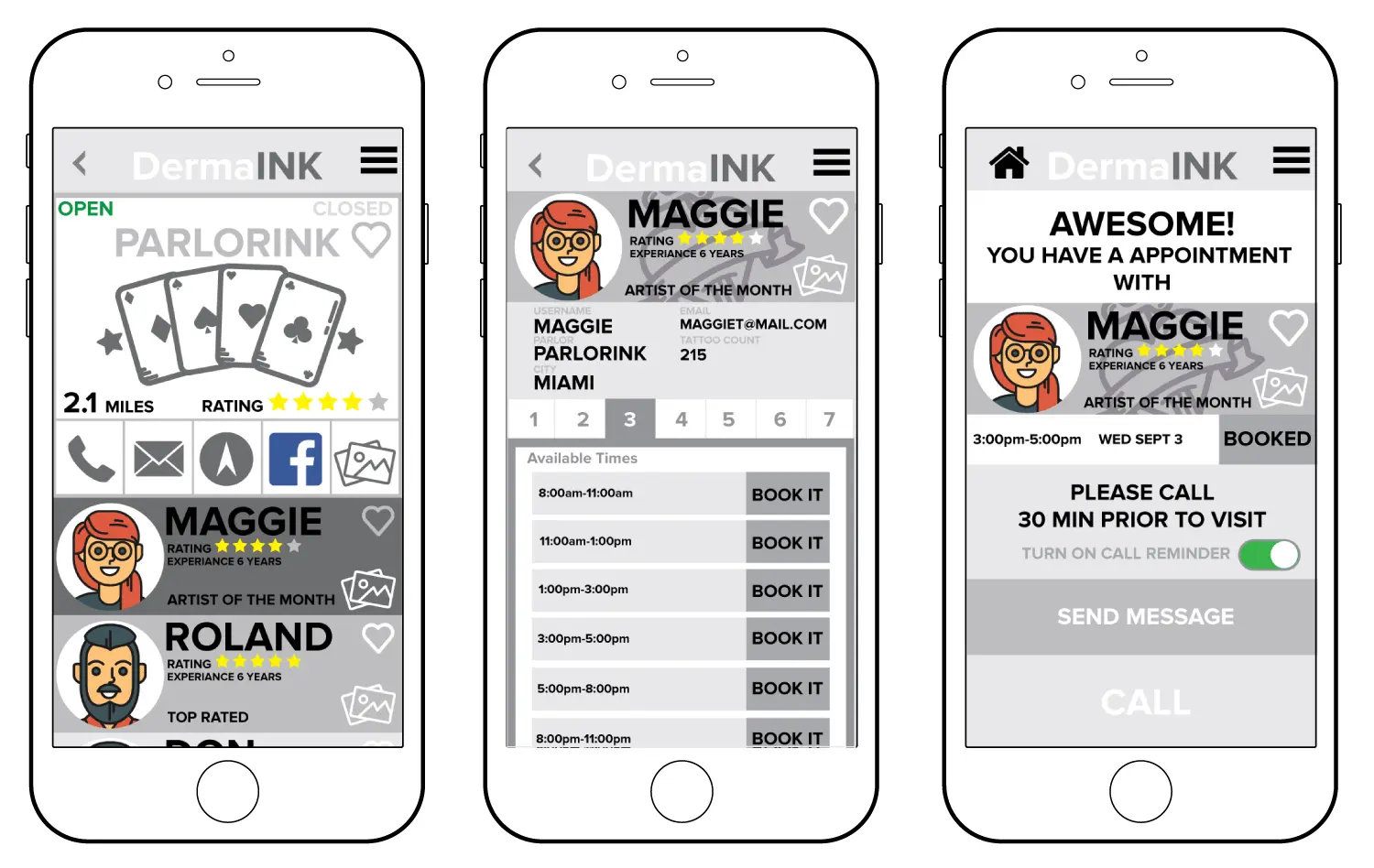
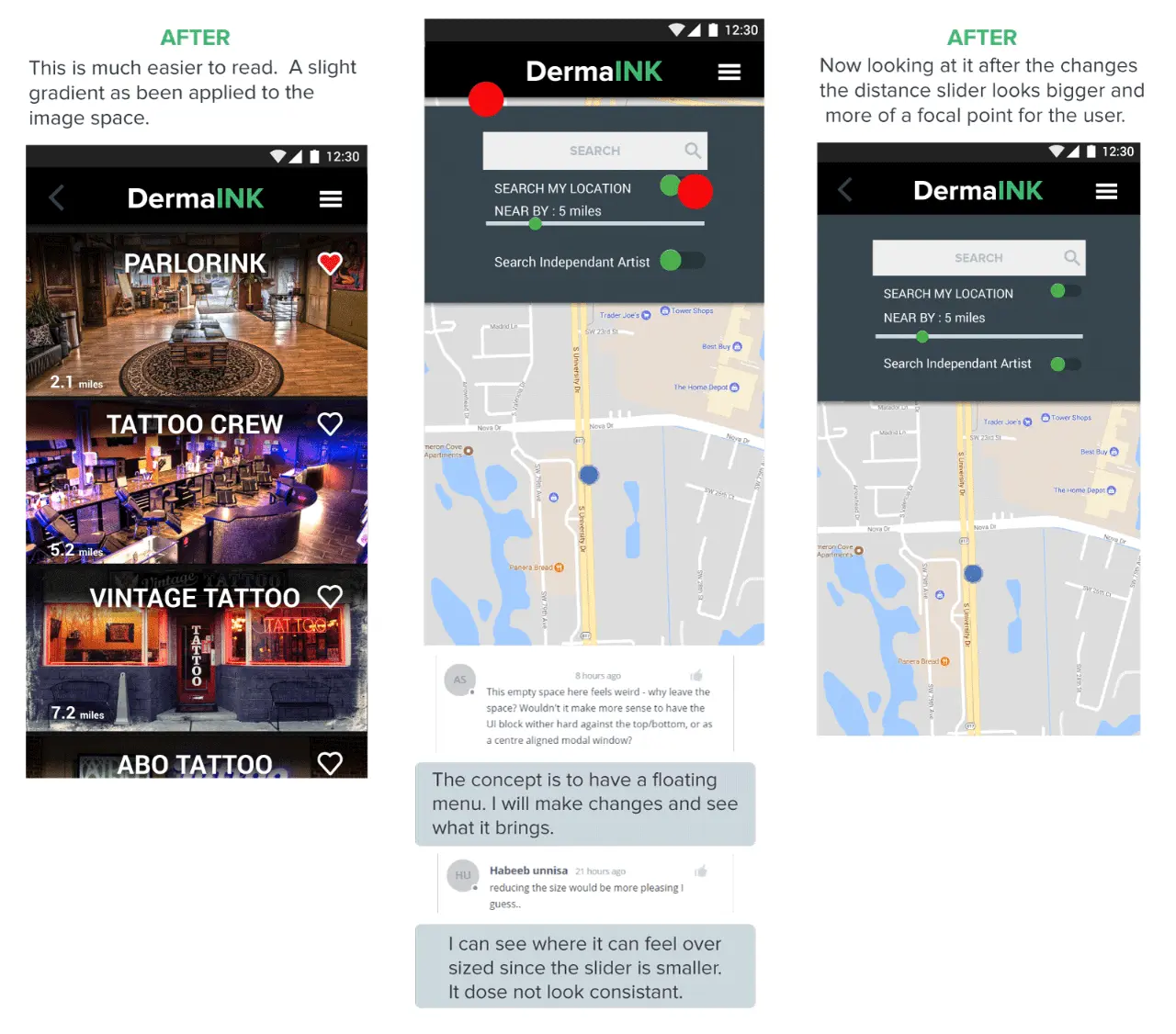
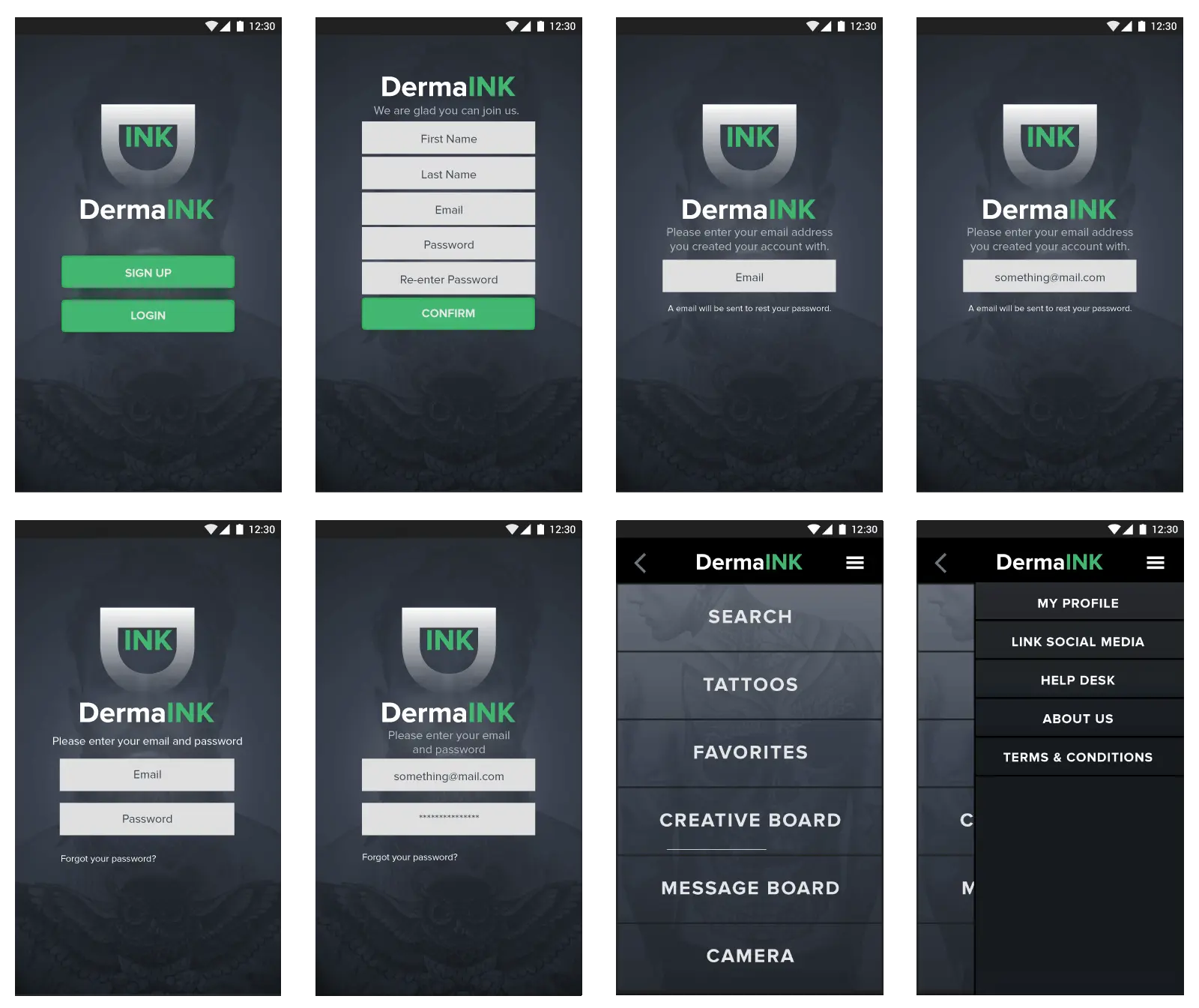
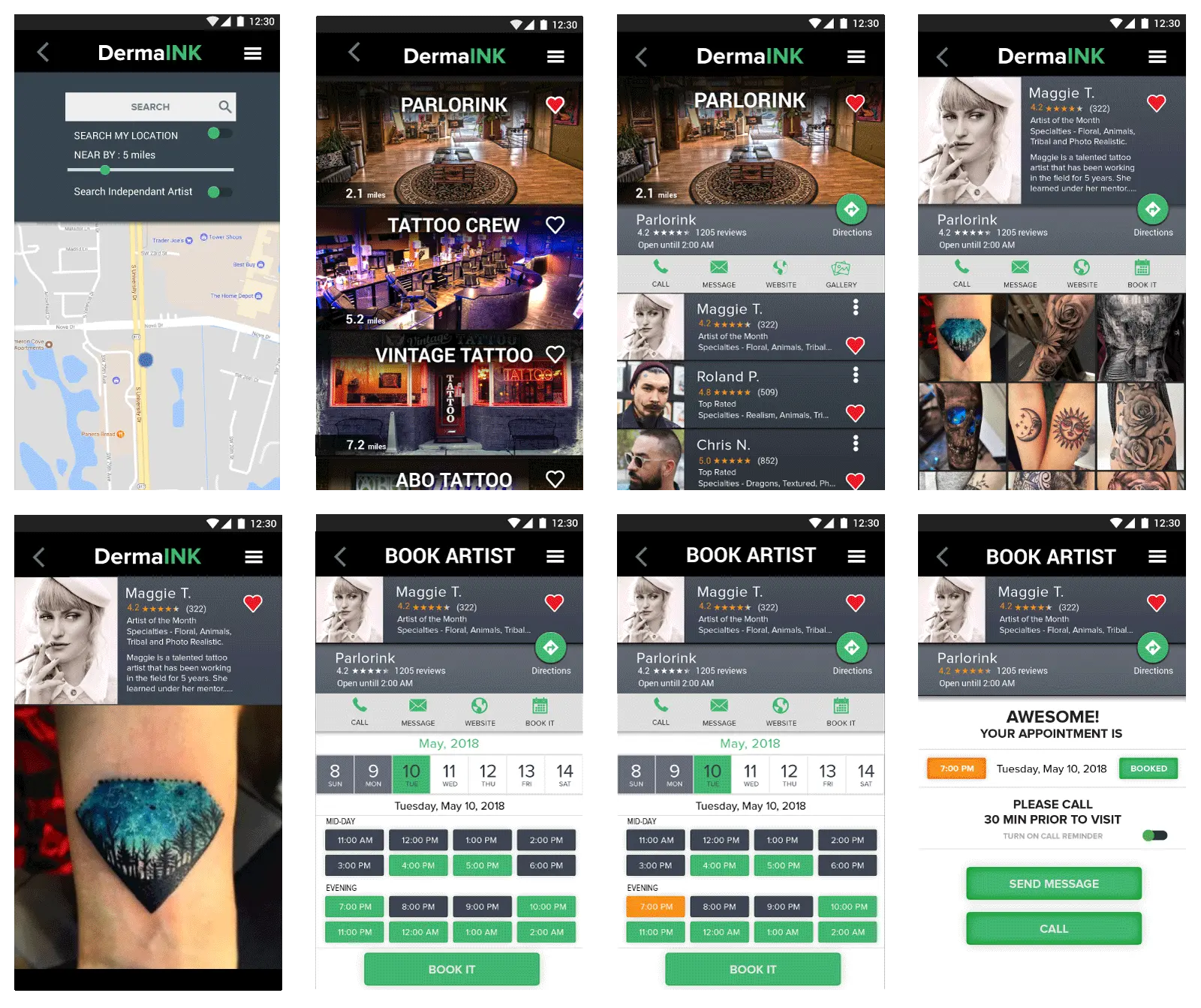
My thought process on what I though people would like to always search but as you can see I made many changes and the interface has changed for the better streamlining the content for better viewing. The Mid-Fidelity wireframe was tested by users to get feed back and continue the process of its iteration and improving on that.
CONCLUSION
All the users had an enjoyable experience with the DermaINK app. The most problematic issue was an unexpected one with the misunderstanding of the search map. The users were impressed that they could see who they could select to do there tattoo.
Like a product in a catalog but just with people and that’s what I interpret what excited them. With all the data collected the resounding positives gives me encouragement that the personas created have led us into the correct direction
A/B TESTING
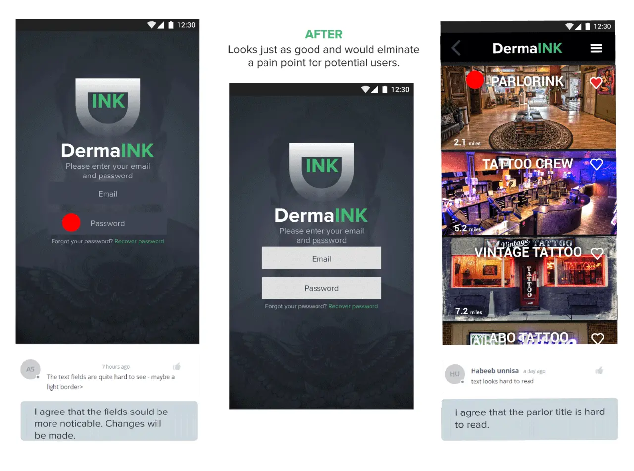
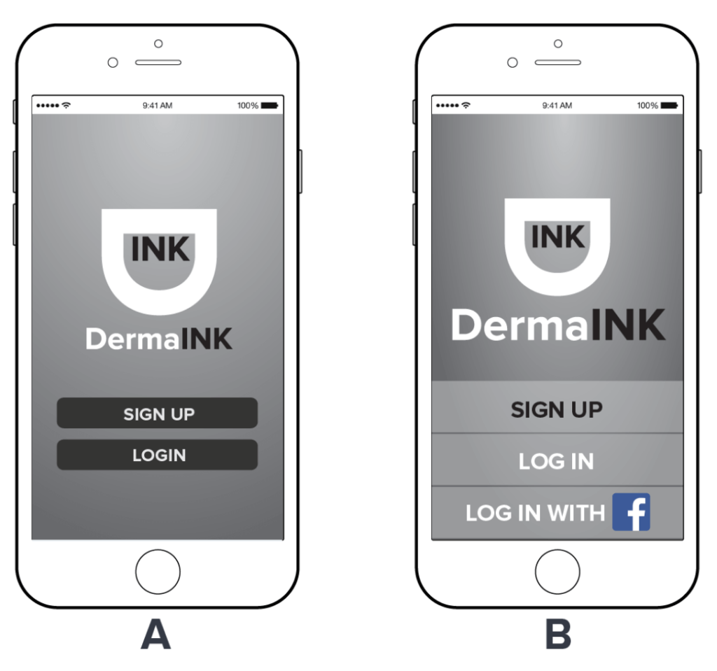
I conducted an A/B test on UsabilityHub.com in order to test two different style of welcome page for the DermaINK app. My goal with this test was to give a simple and cleaner appeal to the DermaINK app with smaller options instead of larger ones. Option A style was very clean with a open landing page where you login or sign up with rounded edge rectangles.. Option B had more of a larger area to select the option to login or sign up.
RESULTS
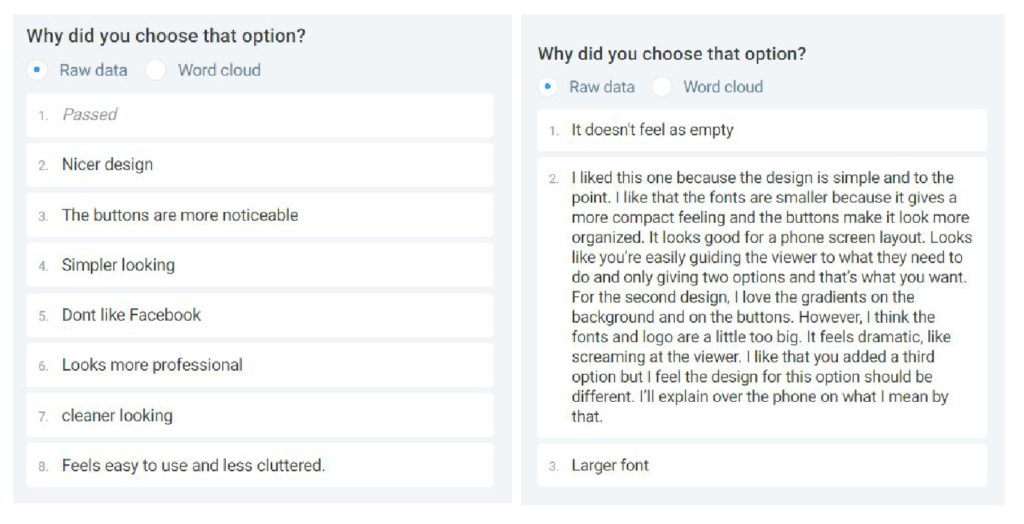
The participants preferred option A by a success rate of 72.73%. The participants reported that the design was cleaner and the buttons were more noticeable. The few people who liked B found it less empty and easier to read.
STYLE GUIDE
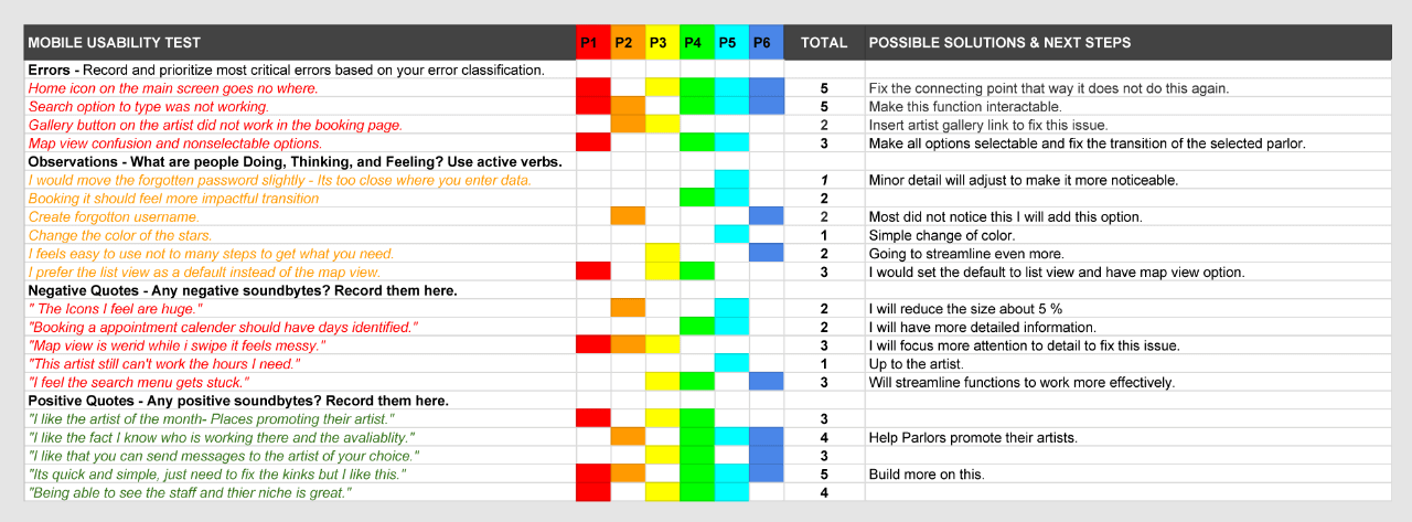
I recruited 6 users for testing and conducted recorded emotional and physical responses for more analytical data. The purpose of the testing was to find users pain points and how quickly they can solve a potential problem they currently have looking for a tattoo artist.
COLORS PRIMARY PALETTE

Primary Palette consist of 3 sets, Emerald, Charcoal, Midnight. The main app color is Emerald, this color will be used for interactive Icons, buttons and text. Charcoal & Midnight are used for
Backgrounds and Text.
SECONDARY PALETTE

Secondary Palette consist of 2 sets, Flames, and Smoke. These important support colors are for rating and liking of a artist, parlor, tattoo image or error. Smoke is to lighten up and give contrast to the primary colors.
TYPOGRAPHY
TYPOGRAPHY

Primary Palette consist of 3 sets, Emerald, Charcoal, Midnight. The main app color is Emerald, this color will be used for interactive Icons, buttons and text. Charcoal & Midnight are used for
Backgrounds and Text.
ICONGRAPHY
DermaINK Icons are from Material Designing. The objective is to use as few icons as possible so as not to distract the user from inspirational tattoo concepts and designs.
