FITTED
UX Case Study 2018
THE PROBLEM STATEMENT
How can we design a mobile app that can help users build positive training habits and introduce new techniques in weight training and exercise?
Category: Fitness App Design
Role: UX Design, UI Design
OBJECTIVE
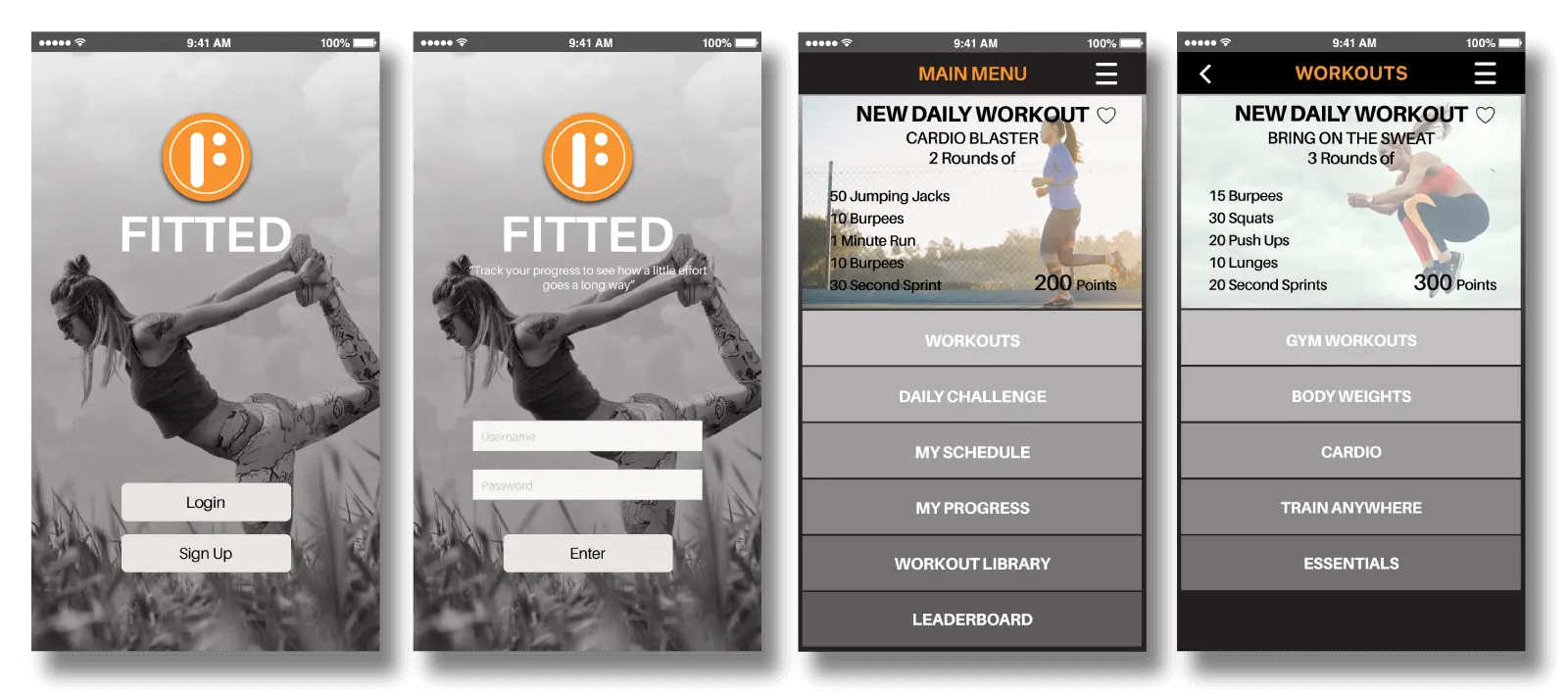
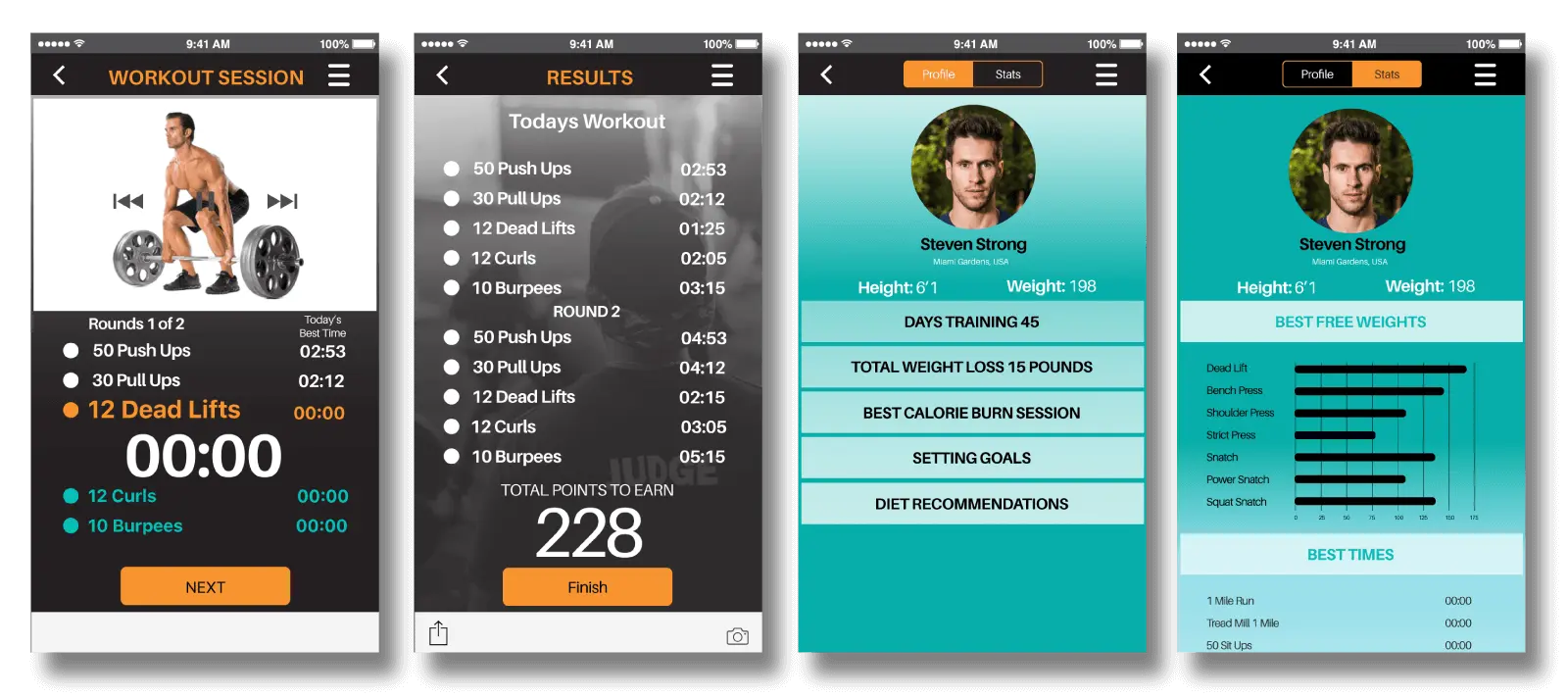
Fitted is an app project that is designed to encourage and motivate its users to start and keep new workout habits. It sends to its users random new workouts to keep a training habit fun and exciting every day. It is made for every user who is willing to make the first step and join the FITTED movement in fitness.
CHALLENGE
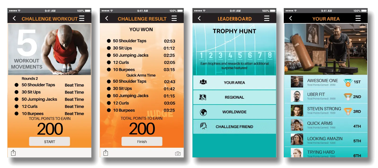
A few challenges during the creation of Fitted is creating a app that is your personal trainer coach but also be a fun game of self competition push your self to the limit. Of course the app can’t yell at you and demand you to drop and give it 20, but it could give you the chance to compete with other users to see who can do 20 faster than the other.
MOOD BOARD
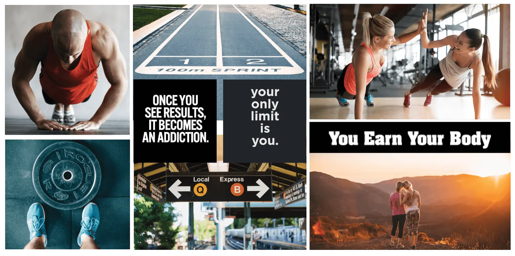
I wanted to convey a fun exploration of self discovery noted when discovering something new and exciting it’s always better when you’re not alone. Whether it being beautiful sunsets or the new found endurance while working out with a friend. Giving a option for those who want to get fast results or those who want to take it little by little one step at a time. Fitted is deisgned to feel like it is tailored to each individual wanting to workout in their pace.
LOW FIDELITY WIRE-FRAMES
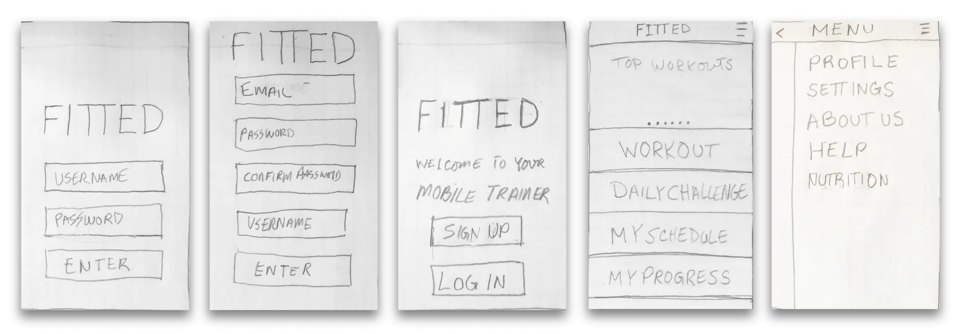
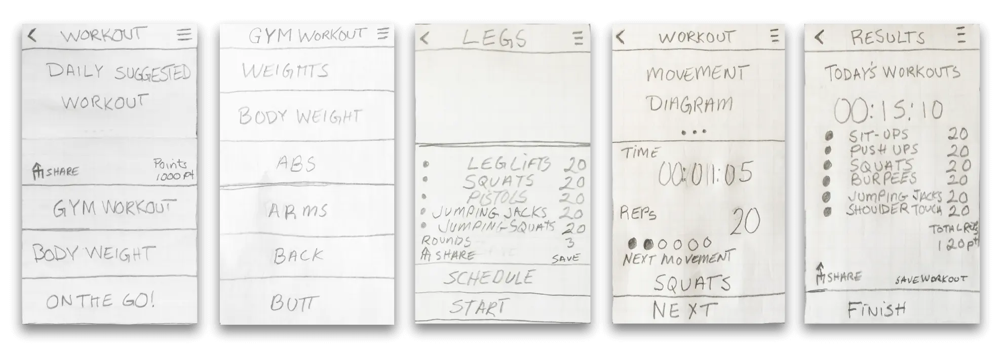
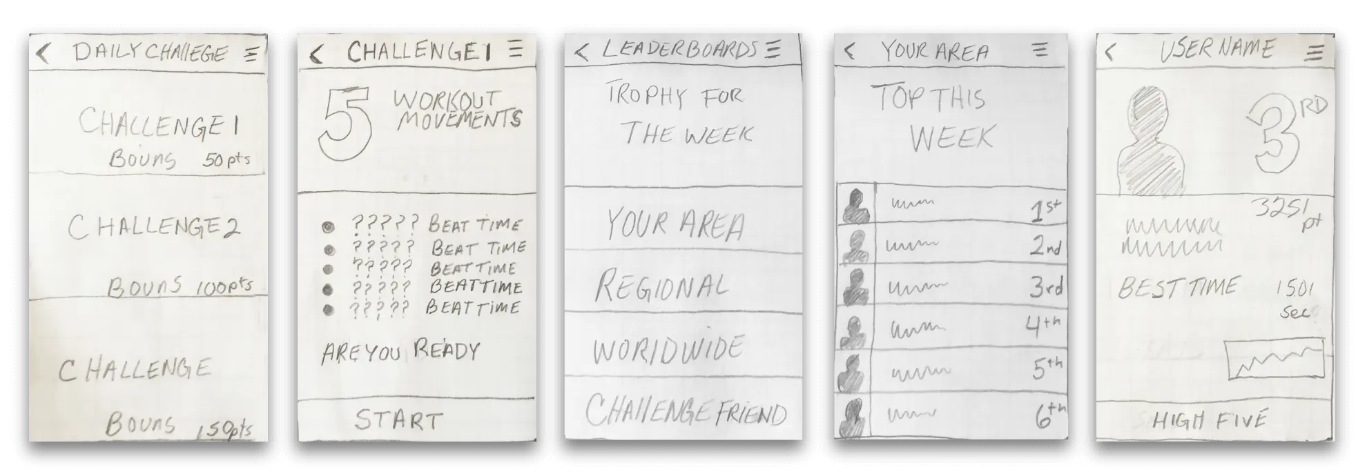
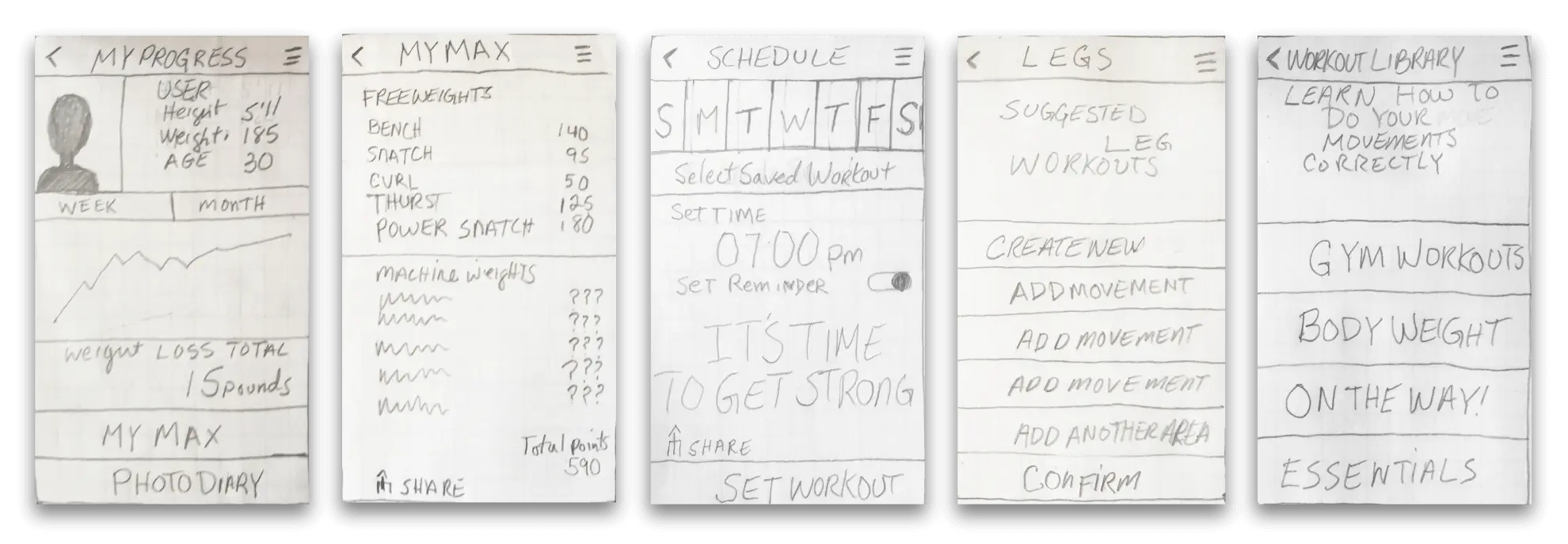
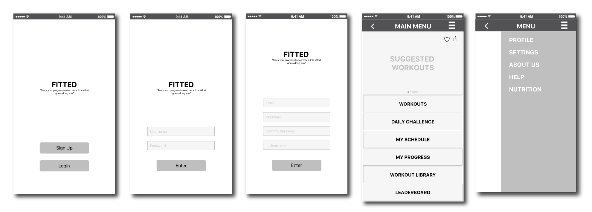
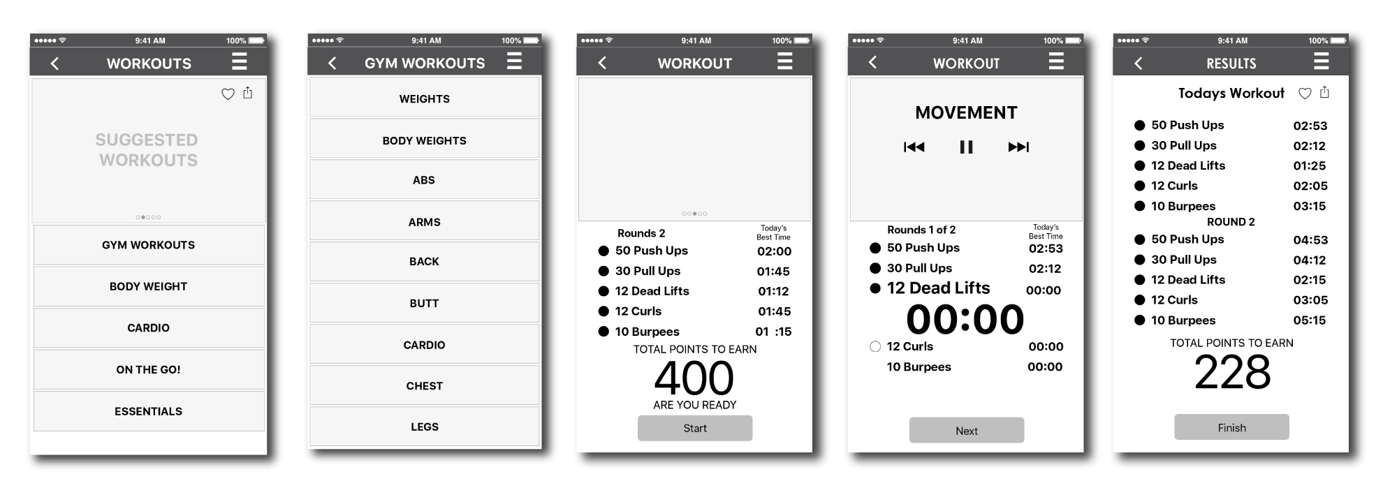
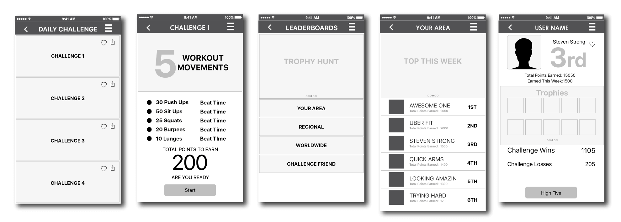
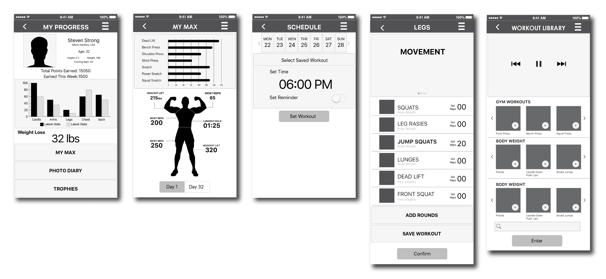
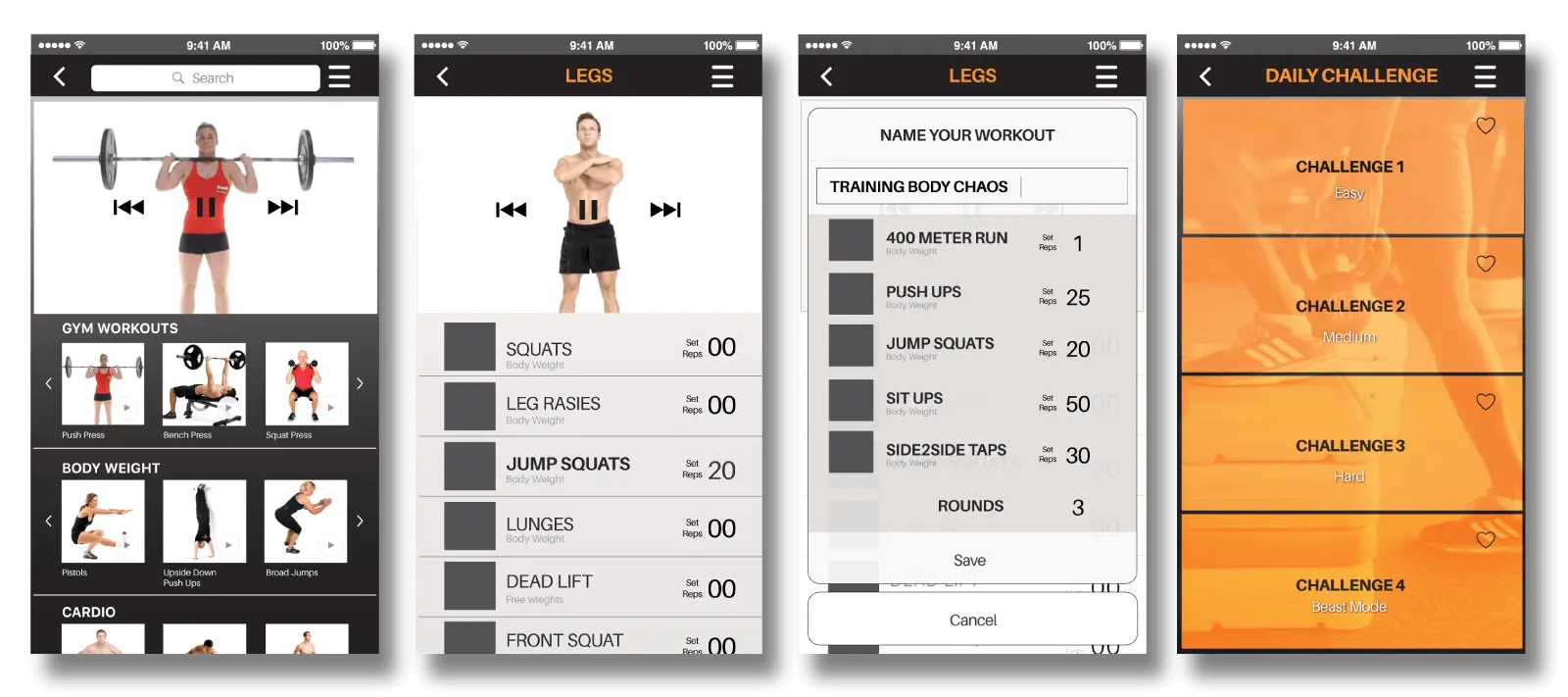
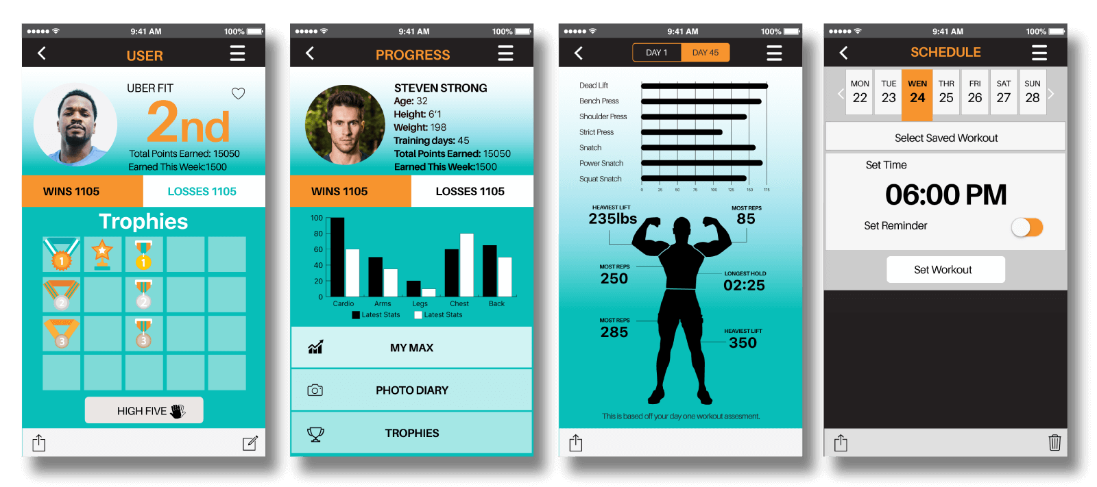
Here are some key screen from the FITTED app in which I sketched and developed on to mid wire-frames. The artistry is amazing I know for UX standards. Just like assembling a model kit each piece in just as important as the next one. Once assembled you see the bigger picture and able to play with it.
STYLE GUIDE
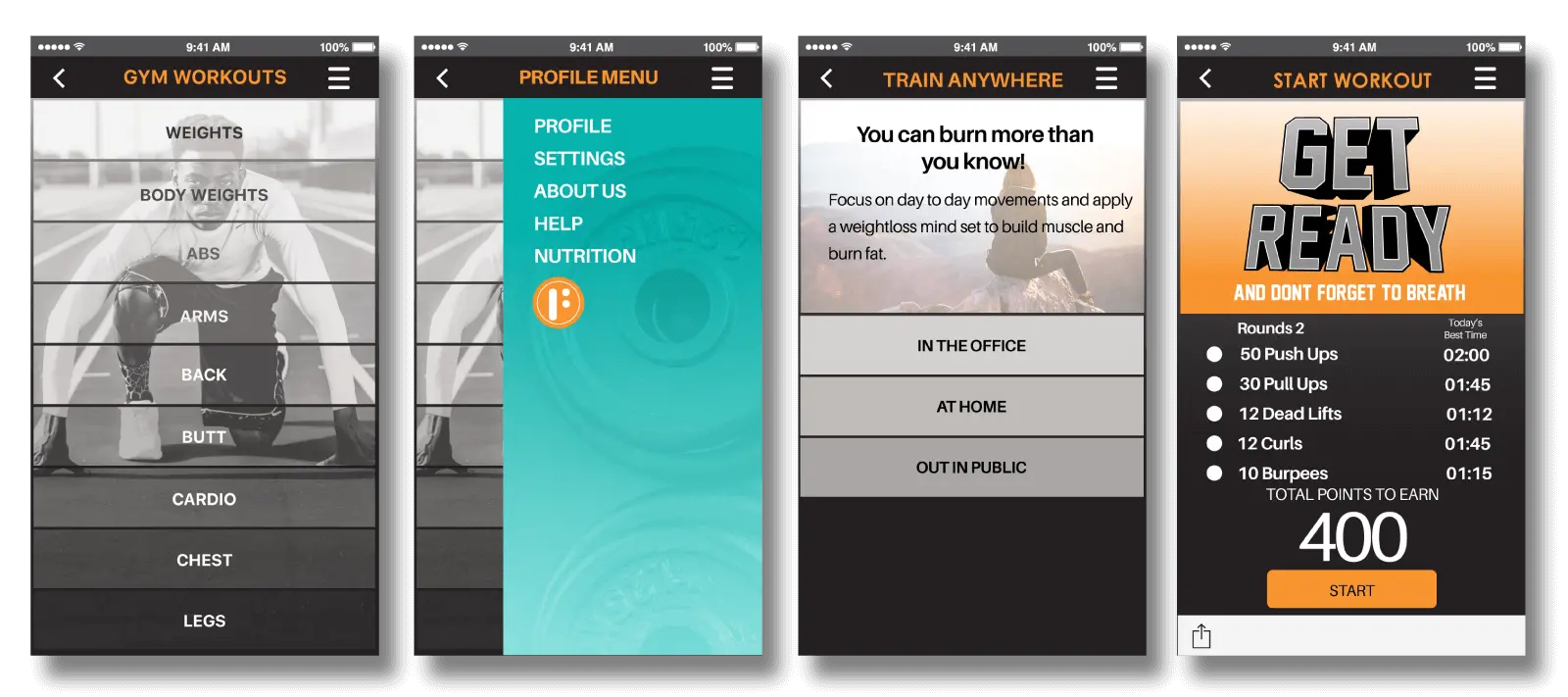
Fitted primary colors are warm and cool colors representing the user’s workout mindset. Cool colors should be used only in non-workout menus. These colors can help users determine where they want to be based on the color. The secondary colors consist of Blue Sky and grey tones. These are accents for backgrounds, icons, text, and illustrations.
COLORS PRIMARY PALETTE

SECONDARY PALETTE

TYPOGRAPHY
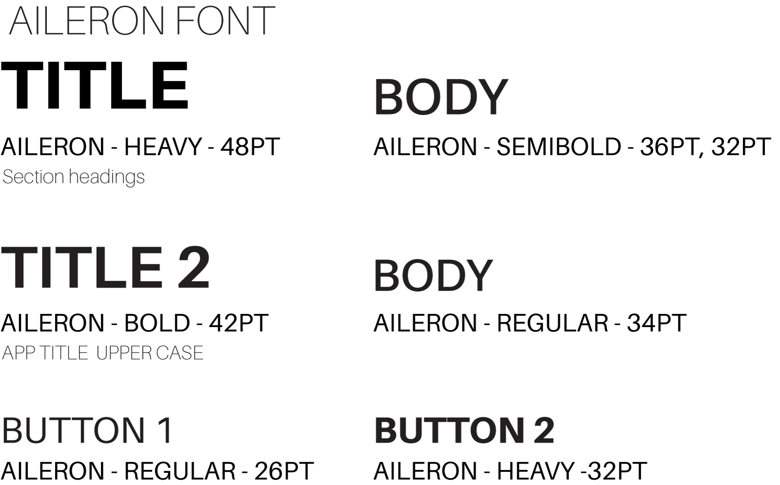
Aileron is a beautiful and easy font to read while the user is in deep training. The font must be easy to read at a glance. Aileron has a huge selection in weights from “Thin” to “Heavy”. Italic weights should not be used.
ICONGRAPHY
Fitted Icons we designed to build comradely among st its users to help motivate them to work and challenge each other.
FINAL THOUGHTS
Being a member of a Crossfit gym gave me a perspective of what I like about it so much and why others love to be there and feel the sweat victory of achieving a small goal, I made an attempted to bring that feeling. Using terms as a coach and certain workout breakdowns, I felt easy it would be easy enough for your new year’s resolution novice but challenging to the common gym rat. When a person works out their response time is not so smooth so simple and large options needed to be apparent so when the user is out of breath huffing and puffing they can quickly see where they need to go. We all have seen it in one form or another but mainly in sports when a reporter asks an athlete how they feel about the game and almost all of them repeat whatever has been ingrained into their minds.
The Fitted app helped me learn how to streamline options where a user may use while looking for the specific workout or game he or she would like to incorporate into their daily lives. Helping users find workout regimes and tools to help them build good habits and it’s up to the Fitted community that forest the drive for users in coming back daily.
